Adding 'fun' to functional!
Adding 'fun' to functional!
Adding 'fun' to functional!
(Solutions)
Marketing Research, Branding
(Year)
2024
Adding the fun in functional.
Posh Tods started with a plan to enter the market with baby and kids' products. But the industry was crowded, and competitors were already established. So, we dug deeper.
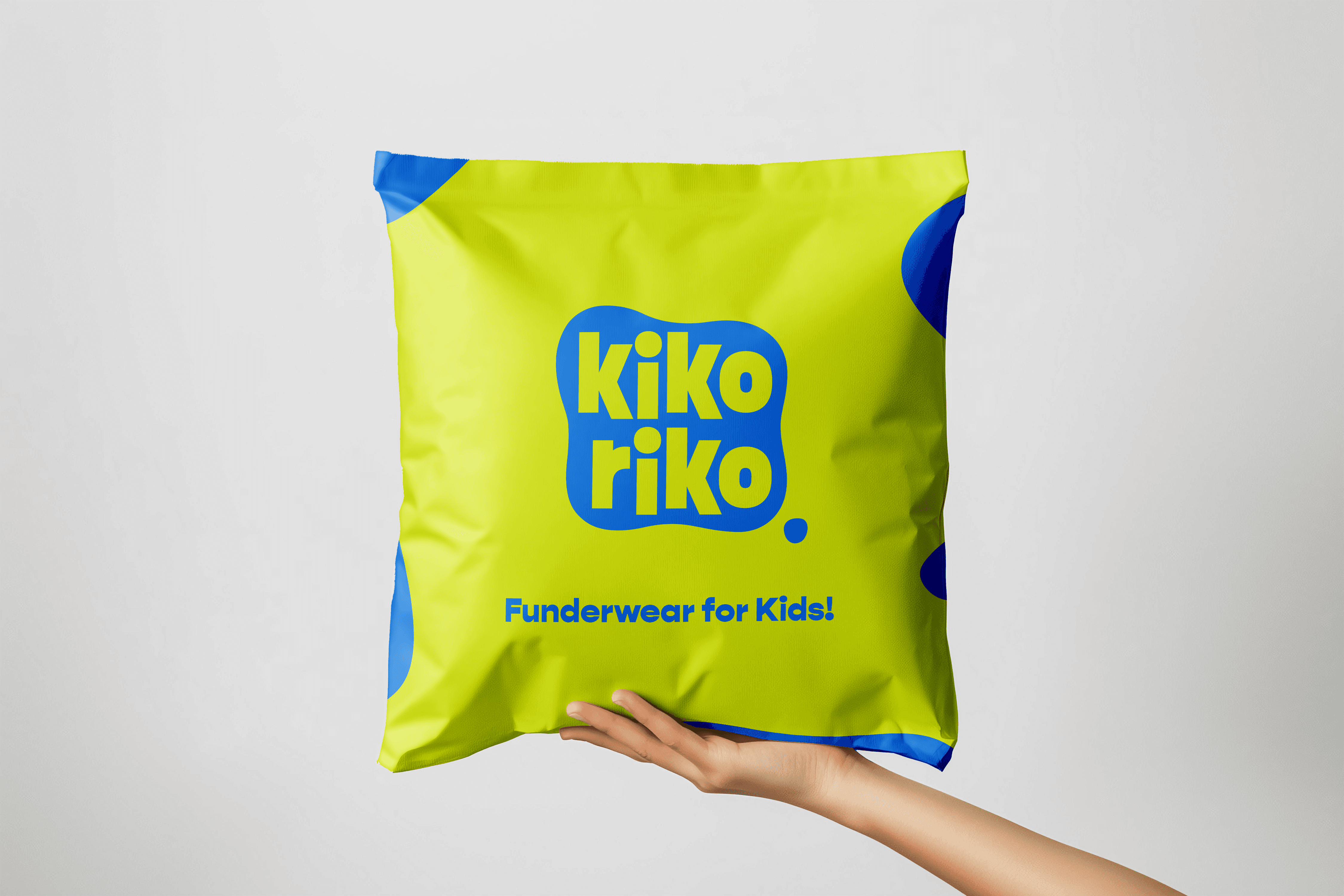
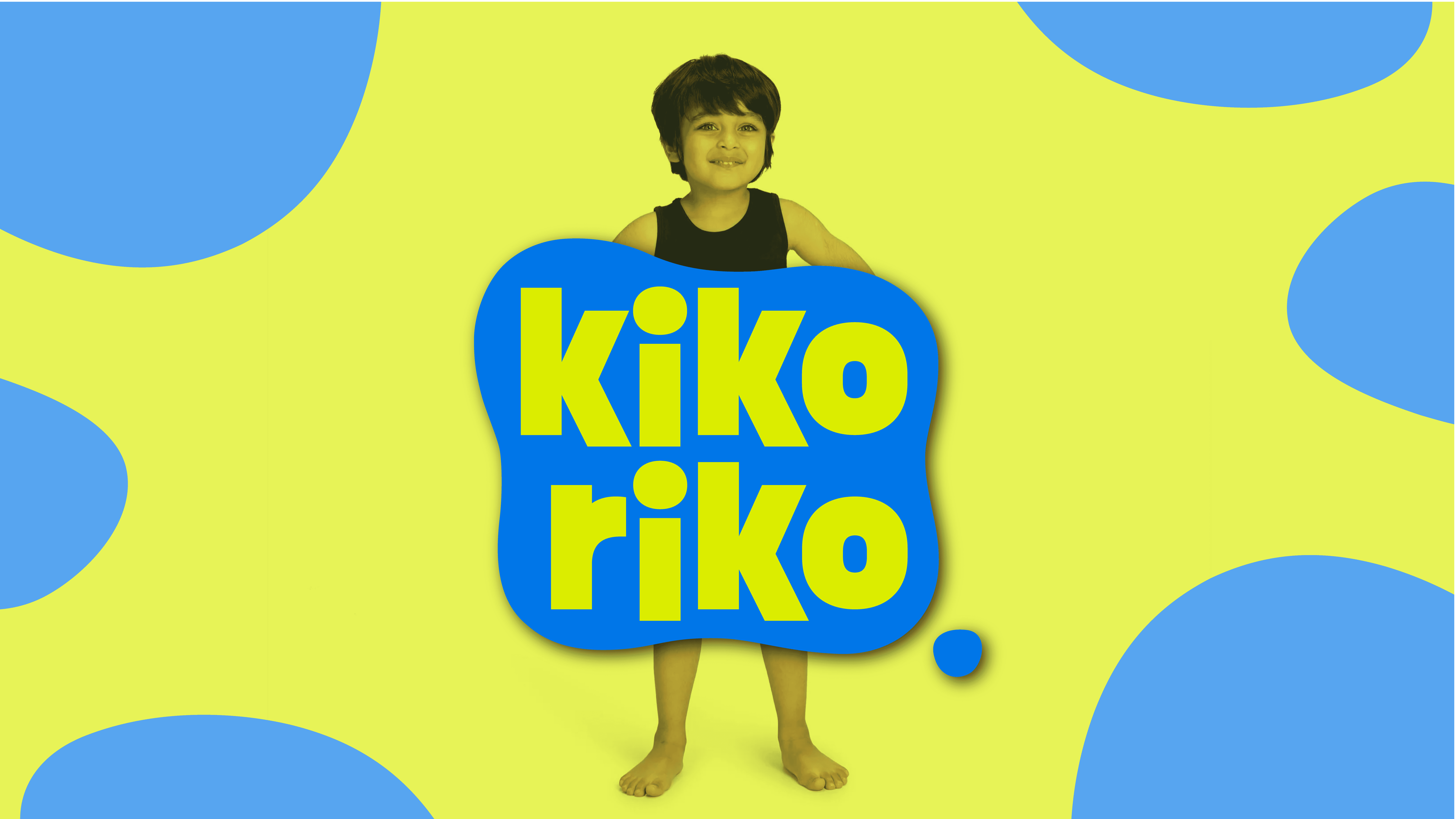
Research revealed the gap no one was talking about, kids' innerwear. While adult brands shrunk their sizes and called it a day, no one claimed the space with intention. That’s where Posh Tods took a sharp, smart pivot. Goodbye, Posh Tods. Hello, Kiko Riko.
A name like a giggle, impossible to forget. The identity followed suit - vibrant, lively, and overflowing with personality. At the heart of it all? The belief that kids deserve innerwear made just for them. Not basic. Not boring. Comfortable, confident, and unapologetically fun.
We shaped the brand’s voice - playful, smart, and intentionally simple. Think conversations, not lectures. The splash logo? A burst of joy, because why should undergarments be dull? We crafted the brand's manifesto, values, and tone, delivering a visual and verbal identity that stood tall (and did a little dance).
With every layer of the brand stitched together, Kiko Riko was ready to hit the shelves. And this time, kids didn’t have to settle for grown-up leftovers. They got what they always deserved, funderwear!
Adding the fun in functional.
Posh Tods started with a plan to enter the market with baby and kids' products. But the industry was crowded, and competitors were already established. So, we dug deeper.
Research revealed the gap no one was talking about, kids' innerwear. While adult brands shrunk their sizes and called it a day, no one claimed the space with intention. That’s where Posh Tods took a sharp, smart pivot. Goodbye, Posh Tods. Hello, Kiko Riko.
A name like a giggle, impossible to forget. The identity followed suit - vibrant, lively, and overflowing with personality. At the heart of it all? The belief that kids deserve innerwear made just for them. Not basic. Not boring. Comfortable, confident, and unapologetically fun.
We shaped the brand’s voice - playful, smart, and intentionally simple. Think conversations, not lectures. The splash logo? A burst of joy, because why should undergarments be dull? We crafted the brand's manifesto, values, and tone, delivering a visual and verbal identity that stood tall (and did a little dance).
With every layer of the brand stitched together, Kiko Riko was ready to hit the shelves. And this time, kids didn’t have to settle for grown-up leftovers. They got what they always deserved, funderwear!