A brand with bite!
A brand with bite!
A brand with bite!
(Solutions)
Marketing Research, Branding, Website
(Year)
2025
No nasties. No noise. Just flavour. truFlavr!
truFlavr wasn’t here to tiptoe into the herb and seasoning aisle. Hydroponic, chemical-free, and grown in India, it had everything going for it. The only thing missing? A brand that made people care.
We dug into the market and found a bland truth. Competitors were stacking shelves with the same tired labels and no real story. Nobody was asking where their herbs came from, and no brand was proud enough to tell them. Customers deserved better.
truFlavr needed to stand up and own its difference. The name led the charge. Bold, sharp, and proud to keep it real. The voice followed. Smart, cheeky, and full of confidence, speaking directly to people who know their flavours. The tagline said it all. "For Those Who Have Taste."
Both in one, a challenge, and a compliment.
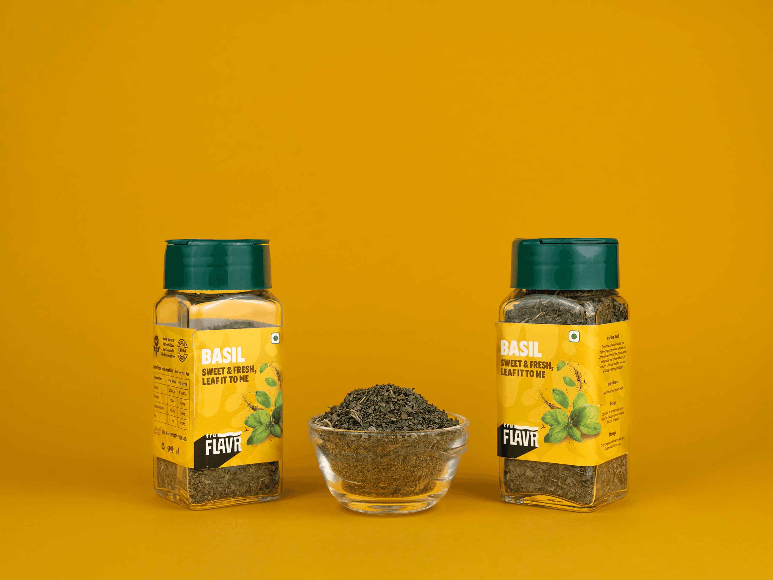
The design brought the attitude to life. A wave in the logo gave a subtle nod to the water that fuels its hydroponic roots. The packaging ditched the earthy clichés and opted for vibrant colours that caught eyes and sparked cravings. The website? Clean, direct, and deliciously easy to navigate.
truFlavr didn’t just join the shelf. It claimed its spot.
No nasties. No noise. Just flavour. truFlavr!
truFlavr wasn’t here to tiptoe into the herb and seasoning aisle. Hydroponic, chemical-free, and grown in India, it had everything going for it. The only thing missing? A brand that made people care.
We dug into the market and found a bland truth. Competitors were stacking shelves with the same tired labels and no real story. Nobody was asking where their herbs came from, and no brand was proud enough to tell them. Customers deserved better.
truFlavr needed to stand up and own its difference. The name led the charge. Bold, sharp, and proud to keep it real. The voice followed. Smart, cheeky, and full of confidence, speaking directly to people who know their flavours. The tagline said it all. "For Those Who Have Taste."
Both in one, a challenge, and a compliment.
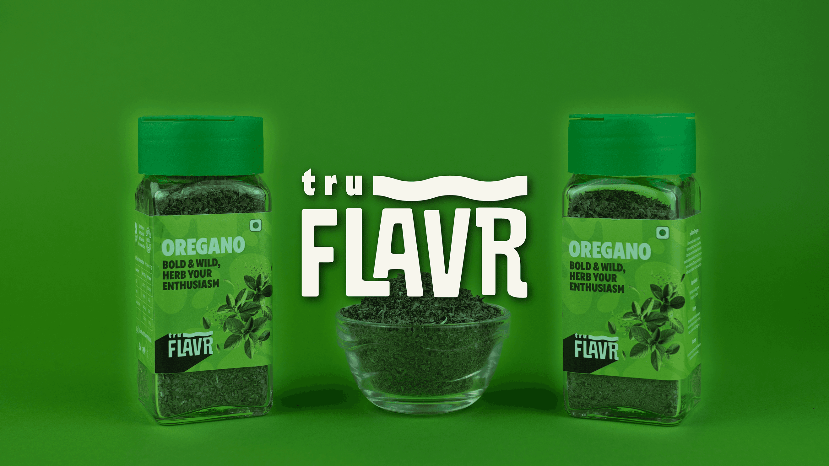
The design brought the attitude to life. A wave in the logo gave a subtle nod to the water that fuels its hydroponic roots. The packaging ditched the earthy clichés and opted for vibrant colours that caught eyes and sparked cravings. The website? Clean, direct, and deliciously easy to navigate.
truFlavr didn’t just join the shelf. It claimed its spot.